
STRATEGY
CREATIVE
Creating a PDP blueprint
for a modern cannabis wellness brand
CHALLENGE
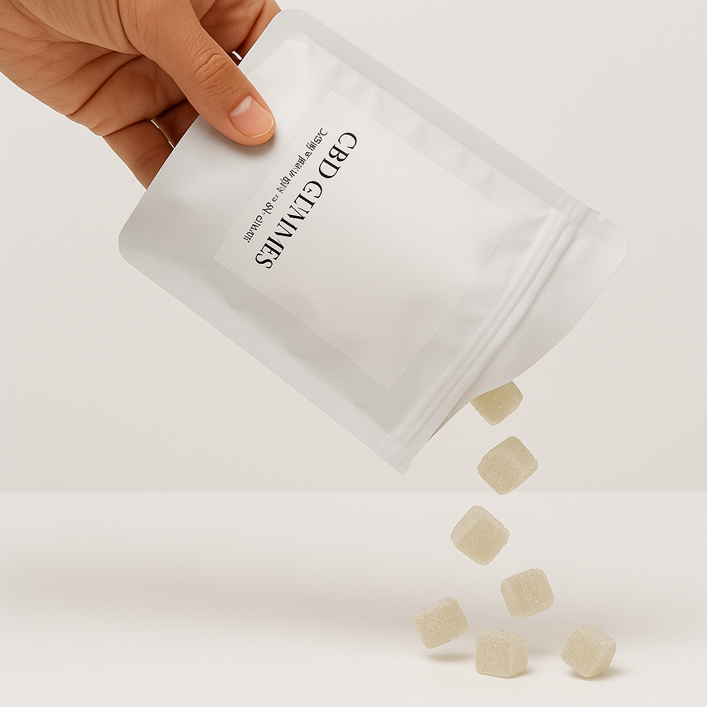
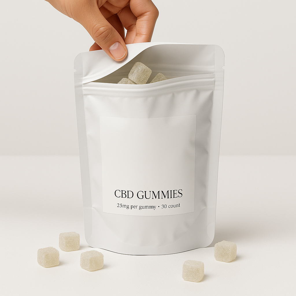
This brand was new to the market, offering a strong product and a compelling story. However, none of that was reflected on the site.
The product pages felt bare. The copy was vague, the education was light, and there was no clear flow to guide someone through the decision.
For a first-time CBD or THC shopper, the page created more doubt than clarity.
Will this actually help me sleep?
How will it make me feel?
Is it safe, and how much do I take?
They needed one master PDP template that could
bring the brand story onto the product page
build trust for cautious first-time buyers
guide people smoothly to purchase
scale across future gummies and flavours
I led creative strategy and copy for the new PDP, from research and insights to page strategy, wireframe, narrative, and close collaboration with design.
Process at a glance
-

Understand audience, brand, and category
Review customer insights, brand goals, and leading CBD and THC brands to spot purchase drivers, friction points, and the space this PDP can own.
-

Set the strategy for the page
Define the core promise and key messages, the objections we need to answer, and the proof that moves shoppers toward purchase.
-

Architect the experience
Translate strategy into a PDP wireframe and content hierarchy, shaping layout, flow, and key interactions so the page feels intuitive, reassuring, and naturally leads to add to cart.
-

Develop and refine creative
Write conversion focused copy, brief designers on the wireframe with clear direction and references, then refine layout and language together through reviews until the PDP is ready to test and scale.
UNDERSTAND AUDIENCE, BRAND AND CATEGORY
Early inputs came from three places
Customer insights
product reviews and comments from women using CBD and THC for sleep and stressBehaviour
Hotjar recordings and heatmaps on the existing PDP to see where visitors stalled, skimmed, or dropped offBrand and category
internal insights from customer service and persona work, plus a review of how other cannabis wellness brands talk about sleep, anxiety, and dosing
Clear patterns emerged
Shoppers were curious about THC but nervous about feeling out of control
Many wanted an alternative to wine or sleep meds and worried about next-day fog
Dosing, timing, and “how will this actually feel in my body” were the biggest unknowns
The job of the PDP
Help a stressed but hopeful shopper feel calm, informed, and safe enough to make this gummy part of a nightly routine.
SET THE STRATEGY FOR THE PAGE
With the audience and context clear, the next step was deciding what this PDP needed to say and prove.
Core promise
Deep, fast acting, predictable sleep support without next day fog
Key messages
A calm slide into sleep, not a heavy knock out
Smooth, fast onset that feels gentle and controllable
Clear guidance on when to take it, how much to start with, and how the experience typically feels
Thoughtful blend of CBD, THC, and CBN designed for steady overnight support
Unique regional flavours that feel familiar and nostalgic, not clinical
Real people finally making it through the night and waking up rested
Objections to answer
Will I feel too high or zoned out
Will I be foggy the next morning
Is this safe on a work night
Is this actually different from other gummies
Proof required
Simple ingredient and process story in everyday language
Reviews and quotes from shoppers who match the target customer
Straightforward dosing and safety guidance that reassures without sounding clinical
This PDP was set as
the main landing for sleep focused ads and email traffic
the template for future SKUs
Everything on the page had to support that strategy.
ARCHITECT THE EXPERIENCE
Strategy moved into Figma for wireframing. The goal was an intuitive flow for first-time THC shoppers that reduces friction.
Key decisions
Lead with how a night on the gummy feels, then layer in cannabinoids and detail as support
Give dosing and timing their own clear block above deeper ingredient content so new shoppers know exactly where to start
Organise product details around real trade-offs shoppers are making, like sleep aids, nighttime wine, and other gummies
Build a light two-path journey so skimmers can scan headlines while detail seekers can go deeper into sections and FAQs
Place reviews, safety notes, and trust markers beside key decision moments, not just stacked at the bottom
The wireframe gave every block a clear job - reassure, explain, prove, or prompt action so by the time design stepped in, layout and interactions were already set up to support conversion, not just look good.
DEVELOP AND REFINE CREATIVE
Story, structure, and design direction were developed side by side so every block on the PDP had a clear job and feel.
A few key decisions shaped the creative
Lead with how a night on the gummy feels, then layer in ingredients and science as support
Carve out a dedicated “how it works and when you feel it” section to address timing and onset directly
Give dosing its own simple, visual moment so first timers know exactly where to start
Thread reassurance through the page in small moments (tone, labels, FAQs), instead of one heavy “warnings” block
From there, the design team was briefed using the Figma wireframe, with clear guidance on
hierarchy and section priorities
how much space each story beat needed
the balance between education, reassurance, and conversion moments
Across design rounds
layouts were adjusted to keep the narrative clear and scannable, especially on mobile
visual emphasis was shifted so trust and clarity showed up at the points where shoppers hesitated in Hotjar
copy and structure were refined together until the PDP felt cohesive and ready to test as the blueprint for future gummies.